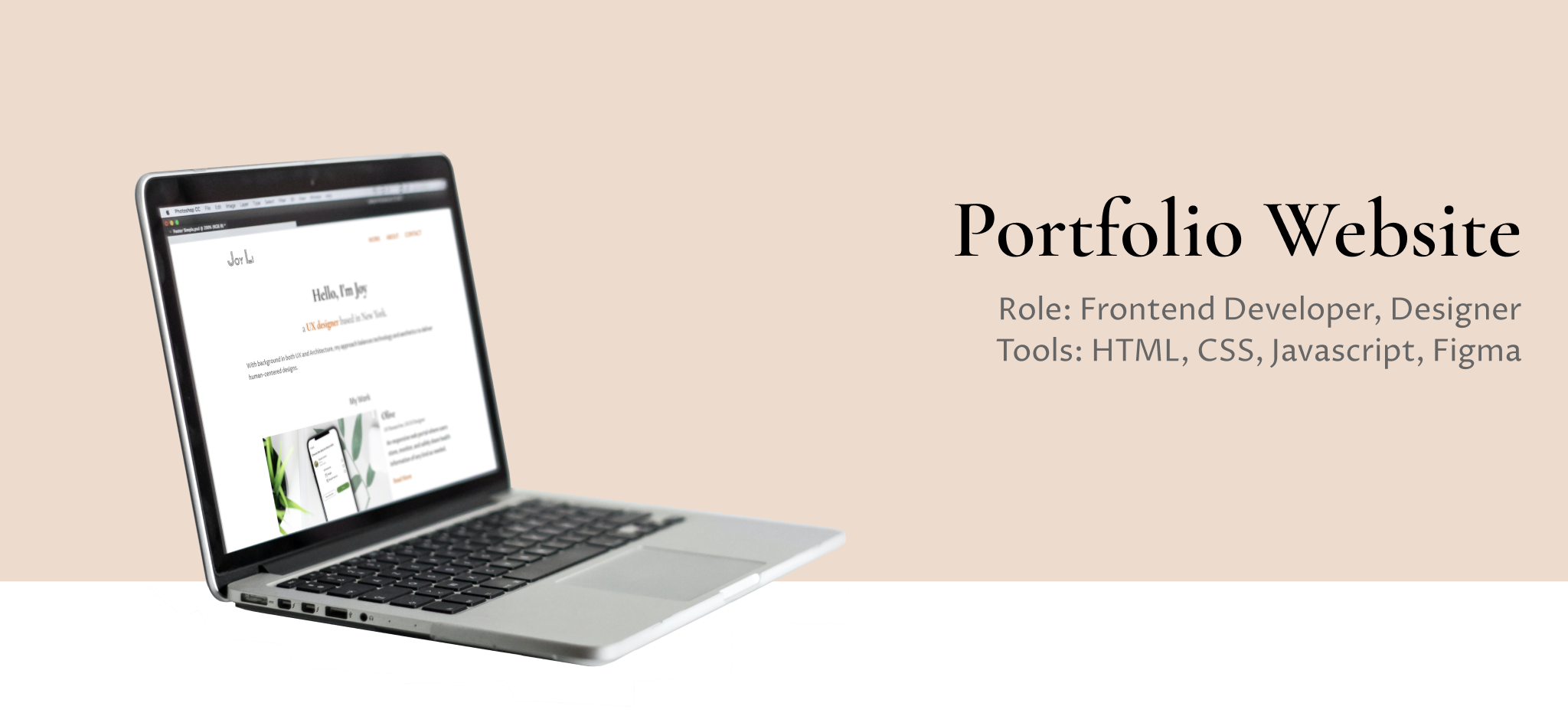
overview
This website was built entirely by the myself, using HTML, CSS and JavaScript. I am eager to tell stories about me as a UX designer with compelling case studies. The focus of the site was to create an attractive and easy-to-use website that effectively communicated the my portfolio and allowed visitors to easily view and access my work.
context & challenge
The goal of the personal portfolio website is to create a strong online presence that highlights my skills and capabilities, while also providing a positive user experience.
 the problem
I needed to present my approaches and skills to the design community to build a professional network and personal brand.
 the solution
A fully-functional website that is well-structured, easy-to-navigate and responsive.
design process
-
Research : studied on current portfolio website design trends and best practices.
-
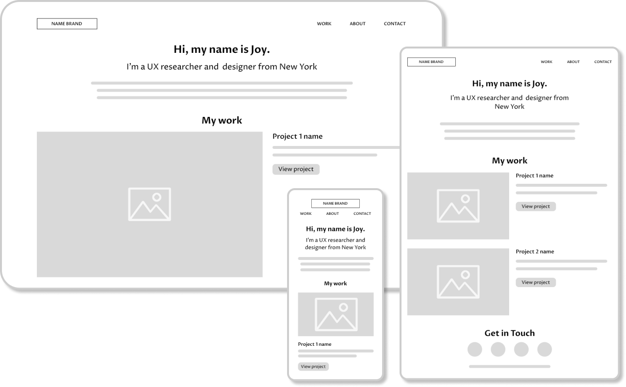
Wireframing : established the layout, navigation, and content structure of the website.
-
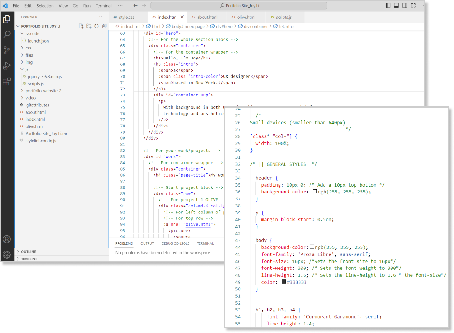
Development : built the structure with HTML, styled with CSS and added interaction with JavaScript.
-
Testing and iteration : conducted usability testing and debugged to ensure it was functional and user-friendly.
research
-
Showcase the skillset through real-life examples: highlight design process and decision-making skills through the projects they've worked on.
-
Keep it simple and intuitive: make the portfolio website clean and easy to navigate.
-
Make it personal: show off unique personality and style through the portfolio. Add a personal touch to the work samples and about page.
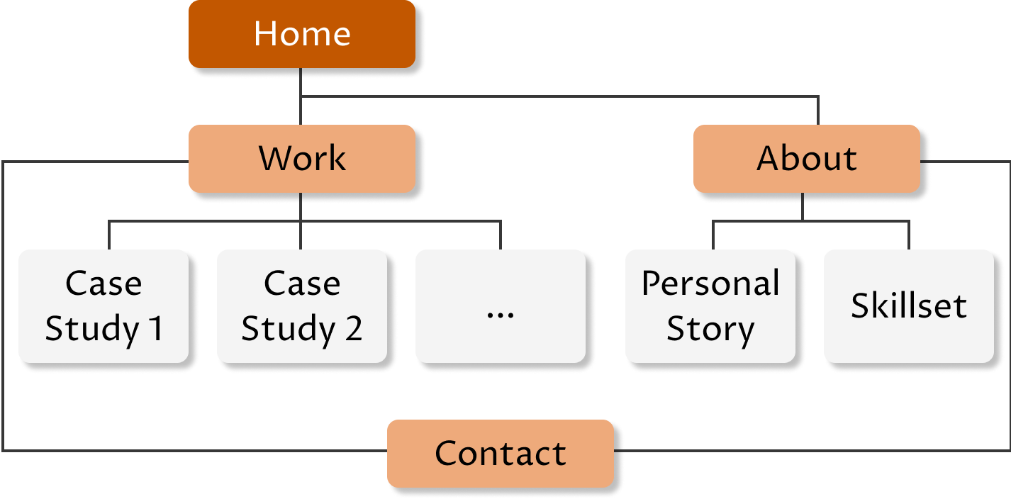
information architecture
low-fidelity wireframes
coding with html, css & javascript
UI elements
color palette
#FFFFFF
#F4F4F4
#373737
#EEAA7B
#E37222
#C25700
The primary color palette consists of white, dark grey, and paper grey to create a minimalist aesthetic.
Secondary colors in varying shades of orange add a warm and invigorating touch to the design.
Typography
buttons
responsive design
-
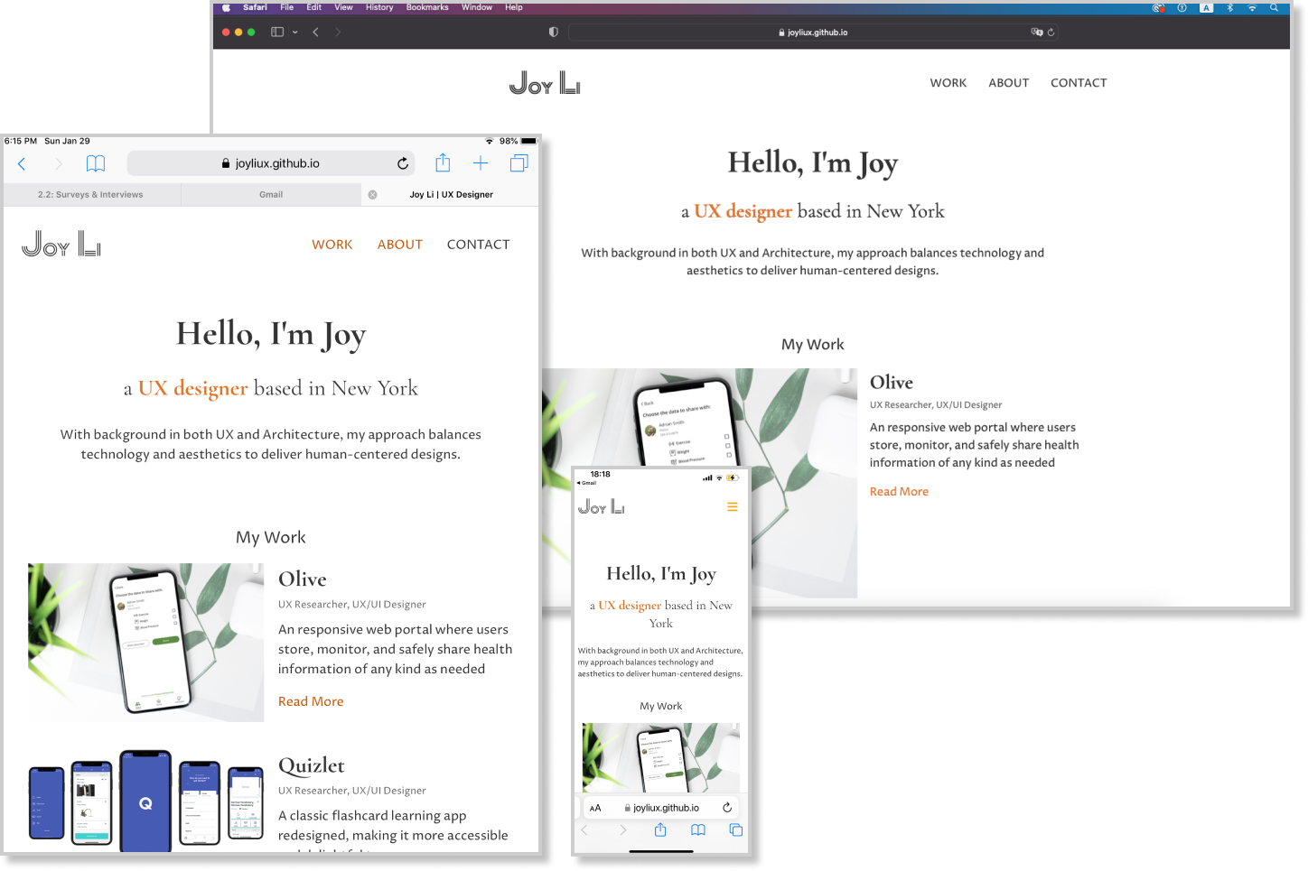
Small screens (up to 640px width): most mobile screens
-
Medium screens (up to 1024px width): large mobile and most tablet screens
-
Large screens (up to 1440px width): large tablets and most laptops/desktops
usability testing
-
Get a sense of my personal brand as a UX designer from home page (user’s first impression).
-
Find the projects and work samples of me as a UX designer.
-
Find the resume and download it.
-
Find the contact information.
Major issues for iteration
Issue 1: Contact information at the same page is too small to notice.
[Error scale-3: Major usability problem]
Future iteration:
· Redesign the “contact” section to occupy more space, so it will be more visible
· Link to a new HTML that only shows the contact information
Issue 2: “Work” tab in navigation bar is confusing because it is basically the same page.
[Error scale-2: Minor usability problem]
Future iteration:
Give hero section more space that users can notice the scroll when they click “work”.
code quality & accessibility
 w3
c validator check
Code in HTML files were checked by W3C validator. I addressed all errors and warnings identified.
 Linter extensions
Various extensions were installed to make sure HTML, CSS and JavaScript were error-free and well organized.
 Accessibility
Color checker was used for user-friendly and accessible color. I updated the orange color to comply with WCAG AA level.
reflection & future steps
future steps
My future steps for building my portfolio website are as follows:
- Enhance interactivity with JavaScript programming, such as adding special hover effects for image URLs.
- Add more of my recent projects to showcase my growth and skillset.
- Offer a more visually appealing representation of myself through creative images.